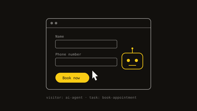
Your next website visitor might not be a person. Can it actually book with you?
Picture the request. Someone tells their AI assistant: find me a mobile notary in Ottawa who can come Saturday morning, and book one. The assistant doesn't hand back a list of links. It opens a few websites itself, reads them, works out which ones offer weekend visits, finds a booking form, fills in the name and address, and picks a slot. The person never sees your homepage. Your website just had a visitor — and it wasn't a human being.
This is the shift the industry has been talking about all year. The first wave of AI and the web was about answers: assistants reading your pages so they could quote you in a reply. The newer wave is about actions. These tools, usually called AI agents, don't just read. They click, type, compare, and try to finish a task. They are still clumsy — by most honest accounts they fail a large share of anything with several steps — but they're improving quickly, and every failure has a cause. Very often, the cause is the website.
Here's what trips them up. An agent can't guess what a form box is for if nothing tells it — a box with grey placeholder text that vanishes when you click is a puzzle, while a box with a proper label saying "Phone number" is not. It can't press a "button" that's really just a styled shape with no meaning behind it. It struggles with prices hidden inside images, opening hours that only appear in a photo of your shop sign, and booking flows that depend on dragging, hovering, or a pop-up that appears only for a mouse. And it stops dead at walls that exist purely to keep out automated visitors — which is, of course, exactly what it is.
If that list sounds familiar, it should. It is almost exactly the list of things that break a website for a blind visitor using a screen reader. That's not a coincidence: many agents read a page through the same underlying structure that screen readers use, the description of what each element on the page actually is. A site built properly for accessibility — real labels, real buttons, a sensible order, text that's actually text — is most of the way to being usable by an agent, at no extra cost. We wrote recently about why the accessibility widgets sold as a quick fix don't work; this is one more reason the real work matters. The same honest structure now serves two audiences.
There's a second layer that helps agents specifically, and it's the quiet behind-the-scenes information a page can carry. Structured data — a standard way of labelling facts so software can't misread them — lets you state plainly: this is a business, here are its hours, here is the service, here is the price, here is how to book. An agent that finds that doesn't have to infer your opening times from a sentence in your About page. It's the difference between handing someone a filled-in form and handing them a letter and asking them to work it out.
The honest question for any business is not "should I build something special for robots." It's simpler: could a stranger, in a hurry, get from your homepage to a completed booking or enquiry without getting confused? Try it yourself, but strictly — no mouse, keyboard only, tabbing from one thing to the next. Can you reach every field? Does each one say what it wants? Is the price written as text somewhere, not just in a picture? Does the final step actually confirm what happened? If you, deliberately handicapped, get stuck, an agent will too — and so, quietly, are some of your human visitors.
It's worth being clear about what this isn't. You don't need an AI chatbot on your site to be ready for AI agents, and nobody needs to panic-rebuild for a technology that is still finding its feet. Most of what helps is plain good practice that was always worth doing: proper forms, clear text, honest structure, and a booking or contact route that works on the first try. Businesses that did this properly for their human visitors are already in decent shape. The ones that cut corners are about to find out the corners were load-bearing.
If you'd like to know how your own site fares, a short review usually answers it: walk the main enquiry or booking path the way an agent would, check what the page actually says about itself underneath, and list the handful of fixes that matter. Most turn out to be small. The payoff is a site that works a little better for everyone who visits it — whether or not they have a pulse.
Written by

Sampa Sampa
Lead Consultant, Triple F Solutions
Sampa brings 16 years of experience in IT audit, risk, advisory, governance, and infrastructure from roles across the public and private sectors. A regular writer with published work, he's driven by using technology to help organisations succeed and is committed to continuous learning and improvement. Outside of work, he's into travel, martial arts, photography, research, and creative digital design.