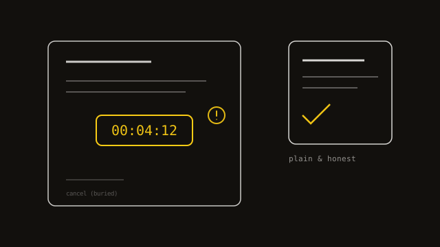
That fake countdown timer isn't just annoying anymore — it's becoming a legal risk
You know the pattern even if you've never heard the term for it. A countdown clock ticking down on a page that resets the moment you refresh it. A checkout that's added trip insurance to your cart without asking. A pop-up asking if you're sure you want to leave, with the decline button phrased as "No, I don't want to save money." A subscription you signed up for in one click and now have to call a phone number, during business hours, to cancel. Each of these has a name. Collectively, they're called dark patterns, and the era where a business could shrug them off as clever marketing is ending.
A dark pattern is any interface designed to get you to do something you wouldn't have chosen if the choice had been presented plainly. The definition matters because it draws a real line: persuasive design isn't automatically a dark pattern. A well-written headline, an honestly scarce item genuinely marked "only 3 left," a clean signup flow that makes it easy to say yes — none of that is deceptive, because none of it depends on the visitor misunderstanding what's happening. A dark pattern specifically needs the confusion to work. Take away the trick and the business loses the sale it was trying to make.
This has been standard practice across enough of the web for long enough that most people have stopped consciously noticing it, which was rather the point. What's changed is that regulators noticed anyway. In the United States, updated rules now require that canceling a subscription be about as easy as starting one — no more "click to sign up, call to cancel." The EU has been tightening its own consumer-protection and digital-services rules around exactly this kind of manipulation. State-level consumer protection laws are increasingly being read to cover it too. None of this is legal advice, and the specific rules that apply depend on where your business operates and where your customers are — that's a conversation for a lawyer, not a blog post. But the direction is unambiguous: what used to be a gray area is being written into black-letter law, one jurisdiction at a time.
It's worth walking through the actual categories, because "dark pattern" sounds abstract until you see the concrete shape of it. Confirmshaming: a decline button worded to guilt you into the other choice, like "No thanks, I like paying full price." Forced continuity: a free trial that quietly becomes a paid subscription with no reminder, banking on you forgetting to cancel. Hidden costs: a price that grows at checkout as "service fees" and "processing charges" appear one screen at a time, after you've already committed mentally to buying. Roach motel: easy to get into an arrangement, deliberately hard to get out — the cancel flow is buried three menus deep, or only reachable by phone, or requires an email that goes unanswered for a week. Fake urgency: a countdown timer, a "12 people are viewing this," a "selling fast" badge that has nothing to do with actual demand. Sneak-into-basket: a pre-checked add-on you have to notice and uncheck, rather than opt into.
Here's a genuinely useful test, and it costs nothing to run: would this still work if it were obvious? Explain your urgency timer, your pre-checked box, your cancel flow out loud to a stranger, in plain words, and watch whether it still sounds reasonable. "We show a countdown that resets every time someone visits" does not survive being said out loud. "We show three business days until the offer expires because that's genuinely true" does. The discomfort of saying it plainly is the test result.
We can say plainly that this site doesn't do it, because the rule predates this article by a long way rather than being written to fit it. There's no fake urgency banner anywhere in this build — an explicit rule from early on, on the grounds that fabricated scarcity is exactly the kind of thing that erodes the trust a bespoke-services business actually depends on. The three client testimonials on this site are real, named, and quoted with permission — not invented, and there's no fake review counter next to them implying more exist. None of that was compliance thinking. It was that a client who catches you in one manufactured lie about "only 2 spots left" will reasonably wonder what else on the page isn't true, and a governance-minded client — the kind who hires us to run a secure board election — is exactly the kind who checks.
If you're auditing your own site, the honest version doesn't require a consultant to spot the obvious cases. Open your checkout and read every line item — is anything there that wasn't shown before the visitor committed to buying? Try to cancel whatever you sell as a subscription, today, as if you were an annoyed customer, and time how long it takes and how many people you have to talk to. Read your own decline buttons out loud. Check whether your urgency messaging is describing something real or something generated on a timer. Most of what needs fixing, once you're actually looking for it, takes an afternoon, not a redesign.
The upside nobody markets is that removing this stuff rarely costs you the conversions you're afraid of losing. Dark patterns work best on a first-time, one-off visitor who won't be back regardless — which describes very little of the business worth having. For anyone selling something people buy more than once, or anyone whose reputation depends on being trusted with something that actually matters, the honest version of the page converts fine and doesn't cost you the customer's goodwill on the way out. Given where the regulatory wind is blowing, it also happens to be the version that's still legal to run in two years.
Written by

Sampa Sampa
Lead Consultant, Triple F Solutions
Sampa brings 16 years of experience in IT audit, risk, advisory, governance, and infrastructure from roles across the public and private sectors. A regular writer with published work, he's driven by using technology to help organisations succeed and is committed to continuous learning and improvement. Outside of work, he's into travel, martial arts, photography, research, and creative digital design.